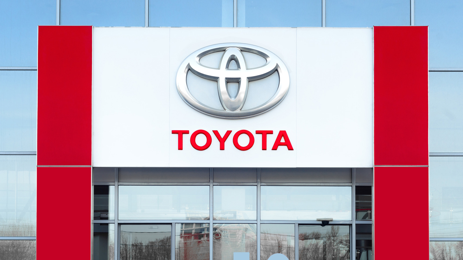
Over the decades, cars and their brands have sported names with deep meanings. This is certainly true of the iconic Japanese manufacturer Toyota. Since debuting as an automaker in 1936, Toyota has gradually risen to become one of the leading names in the automotive and tech industry, only slightly behind Ford in U.S. sales. Beyond the innovation and consistently fantastic output Toyota has brought to the market, its fortune may be thanks in part to the meaning behind its name.
Advertisement
The origin of the Toyota name stems from the Toyoda family. Kiichirō Toyoda, son of founder Sakichi Toyoda, would be the one to introduce an automotive division during the early 1930s, when the company was known for inventing the Toyoda Model G Automatic Loom. The company’s early vehicles were sold under the Toyoda name, but it was later decided to alter this as a way of giving the automotive brand a unique identity. In 1936, following a public contest to find a new name, it was decided that “Toyota” would be the car company’s moniker.
So why did changing one letter that made such a difference? Well, it’s not the letter itself so much as it is the construction of the word. In Japanese, “Toyoda” requires 10 strokes to write and “Toyota” only uses eight. While this made the name easier to write and market, the number eight also represents good fortune and wealth in Japanese culture.
Advertisement
The logo is equally interesting to decipher
Whether the company’s success can be credited to swapping out one letter for another is debatable, but “Toyota” remains a timeless title. No matter what language you speak, however, an equally enduring element of the Toyota brand is its simple, yet stylish logo that sits on everything from hefty Toyota SUVs to sleek Toyota luxury cars. And just as with the company’s name, there’s more to Toyota’s logo than meets the eye.
Advertisement
The Toyota logo as we know it today didn’t come into existence until late 1989, introduced as a way of celebrating the company’s 50th anniversary. Its look is in line with principles of Japanese design, with curves and lines sharing similarities with calligraphy. However, it’s the orientation of these overlapping ovals where the logo’s true meaning comes into play.
The vertical ellipsis in the middle of the logo is meant to symbolize the heart of Toyota customers and products. The curved horizontal line within the middle of the logo that crosses through the vertical ellipsis pulls double duty, embodying the union of Toyota and its customers while also looking like the letter “T” — and like a steering wheel. The surrounding exterior oval showcases the embrace Toyota has received worldwide. In 2020, Toyota altered the design to be more graphic and flat, as a way of indicating its transition into offering a wider range of mobility devices while following modern minimalistic design trends.
Advertisement

